7 Kitchen Cabinet Neutral Colors Ideas to Brighten Your Home
Picking a color for kitchen cabinets can honestly feel overwhelming. I’ve found that neutral shades strike a great balance between style and flexibility.
They blend well with all sorts of design themes and don’t go out of style quickly.
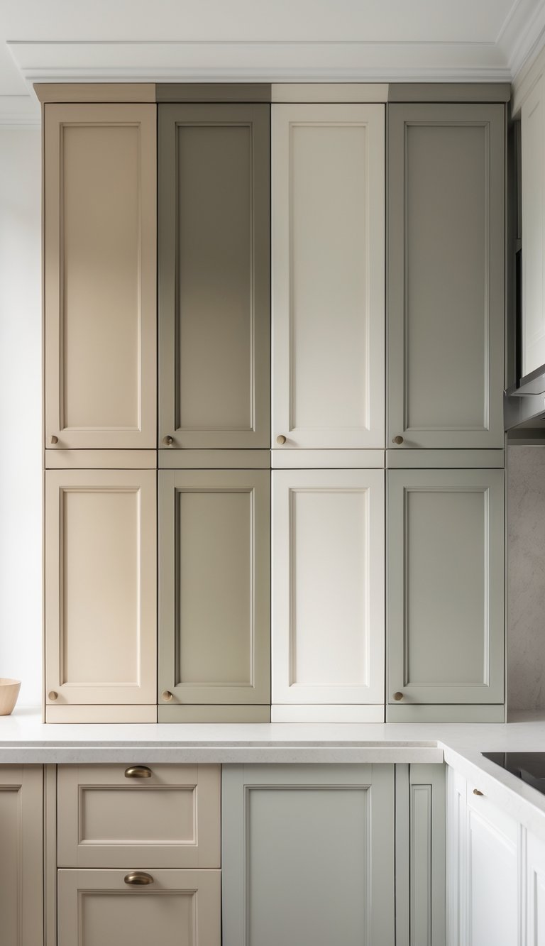
Neutral cabinet colors make your kitchen feel warm, calm, and timeless, no matter your decorating style. I’ve got seven simple ideas to help you pick a neutral color you’ll love for years.
1) Soft Taupe Cabinets
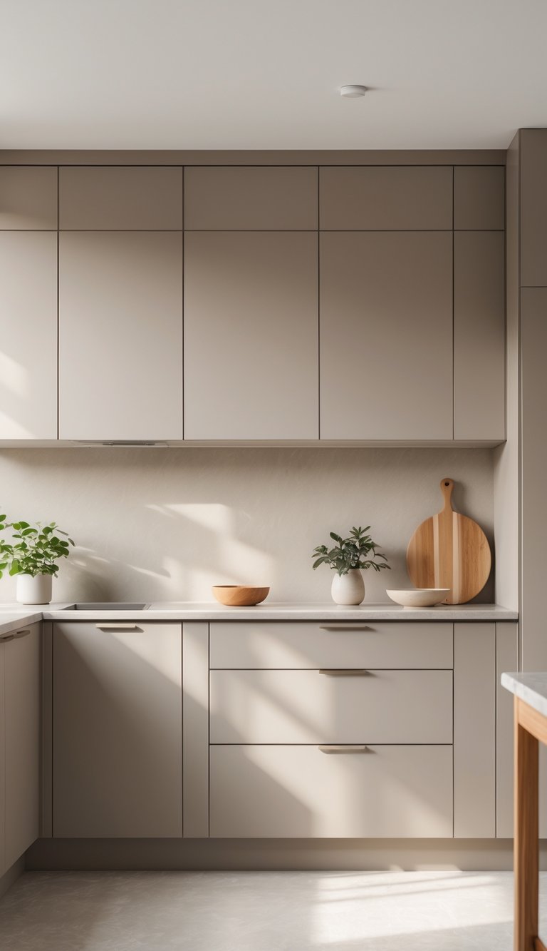
I like soft taupe cabinets because they feel warm and neutral at the same time. Taupe sits between gray and beige, so it’s easy to match with a lot of styles.
Christmas & Year-End Deals On Amazon !
Don’t miss out on the best discounts and top-rated products available right now!
*As an Amazon Associate, I earn from qualifying purchases.
It adds a cozy, calm vibe to any kitchen. I think it’s perfect if you want an inviting space that isn’t too bold.
2) Edgecomb Gray by Benjamin Moore
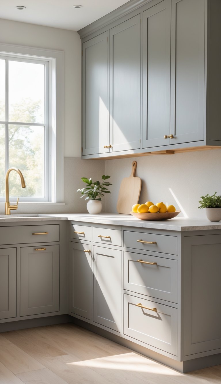
I really like Edgecomb Gray. It’s a soft, warm gray that feels cozy and neutral.
This color shifts depending on the light—warmer in sunlight, cooler with lamps. It’s a great choice if you want a calm, fresh look without going too light or dark.
I’ve seen it brighten up spaces while still keeping things simple and inviting.
3) Beige Cabinets

I like beige cabinets because they feel warm and welcoming. Beige is a soft neutral that works with so many styles, from modern to farmhouse.
It’s simple but adds a cozy touch to the kitchen. Beige comes in shades from light cream to deeper taupe, so it’s easy to match with different countertops and hardware.
I think beige cabinets are a solid way to keep things calm and timeless.
4) Warm Greige Shades
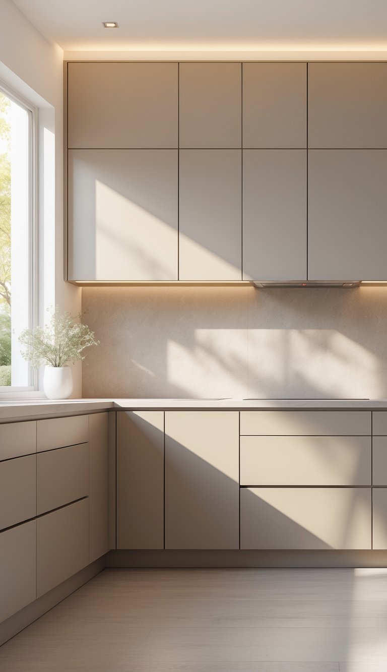
I like warm greige because it mixes gray and beige in a soft, cozy way. It’s not too cold or too warm, so it fits with lots of kitchen styles.
Warm greige cabinets make a kitchen feel inviting but still clean and modern. They work well with wood and light countertops, adding just a bit of warmth.
5) Creamy Off-White Tones
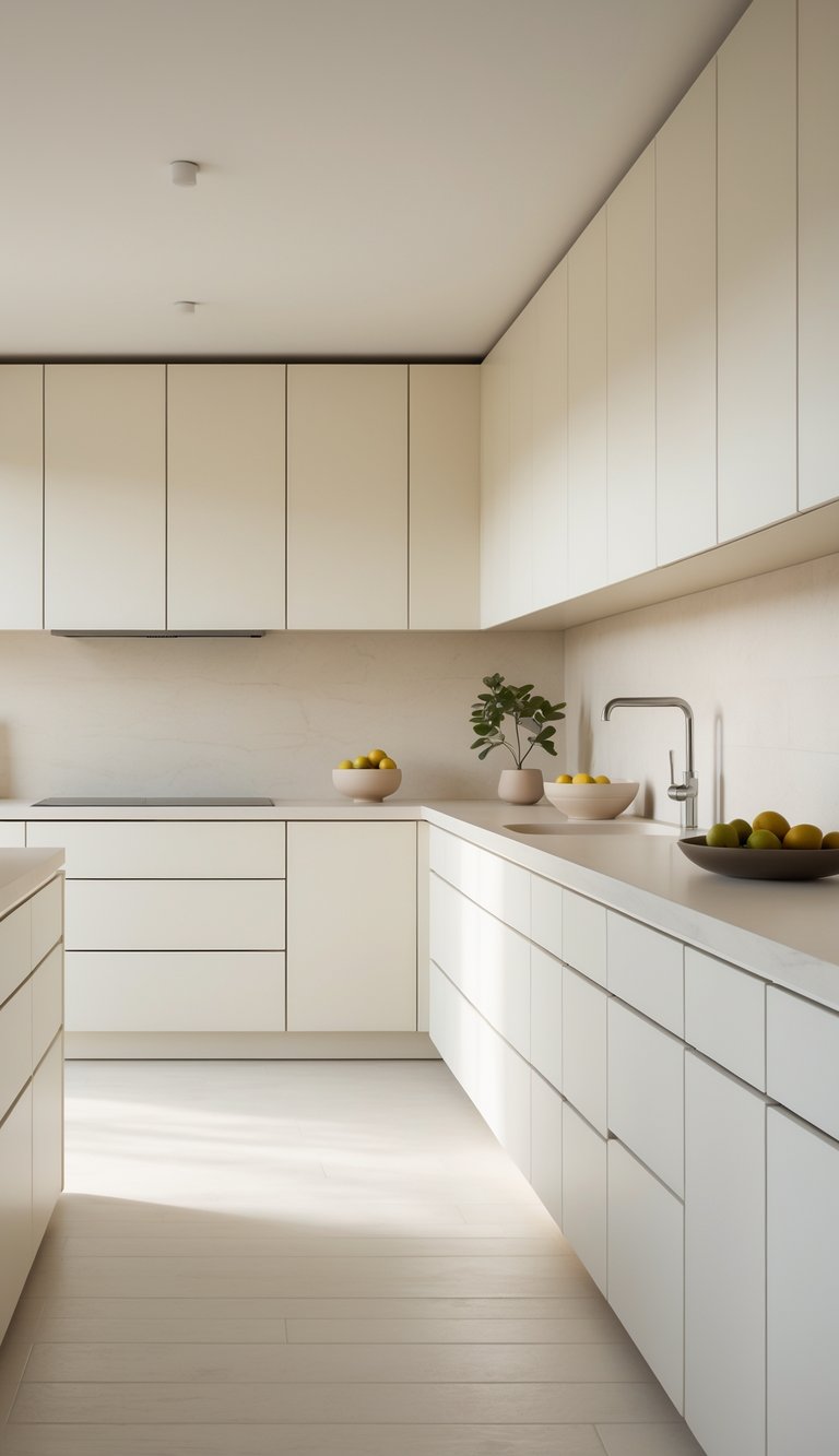
I love creamy off-white tones because they bring warmth without being too bright. These shades fit in both modern and traditional kitchens.
They add a soft, inviting feel that brightens the room but still feels cozy. Creamy off-white looks great with wood finishes and darker accents.
It’s a nice way to keep your kitchen neutral but a bit elegant too. I find it easy to match with all kinds of styles and accessories.
6) Light Mushroom Hues
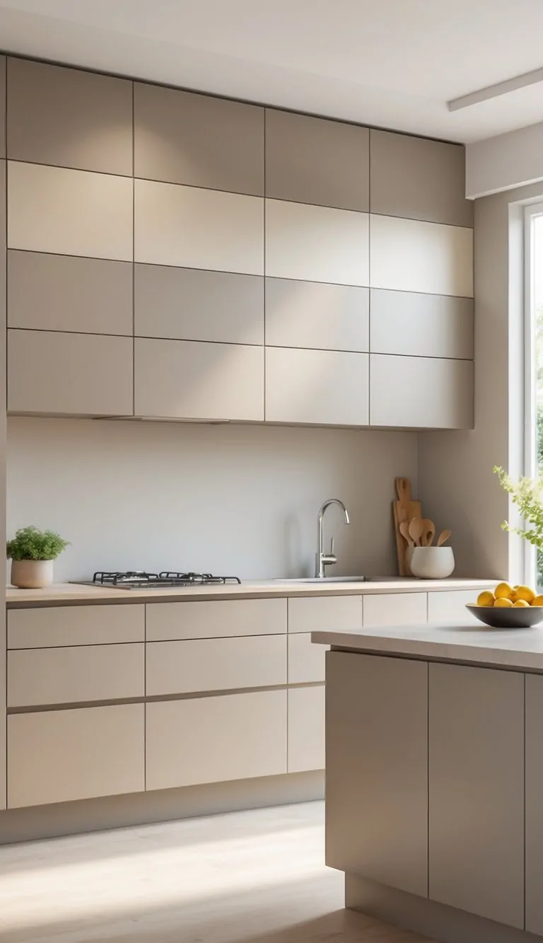
I like light mushroom hues because they feel soft and warm. These colors mix beige and gray in a gentle way.
They make my kitchen cabinets look calm but still fresh. Light mushroom shades work with all sorts of styles.
Christmas & Year-End Deals On Amazon !
Don’t miss out on the best discounts and top-rated products available right now!
*As an Amazon Associate, I earn from qualifying purchases.
They’re subtle but add some depth. I think they’re perfect for a neutral, inviting kitchen.
7) Muted Stone Colors
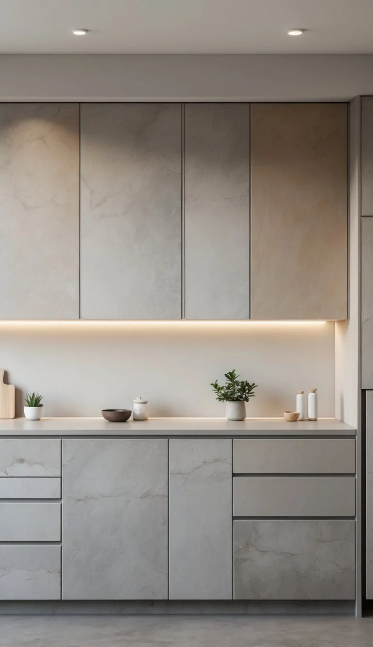
I like muted stone colors for kitchen cabinets because they feel calm and natural. Soft greys, warm taupes, and gentle slate tones create a soothing space without being too bold.
These shades work with many countertop materials and add a timeless look. I can add brighter accents, like brass handles or a colorful backsplash, and nothing clashes.
Muted stone shades are simple but stylish. They really fit a lot of kitchen styles.
Benefits of Neutral Cabinet Colors
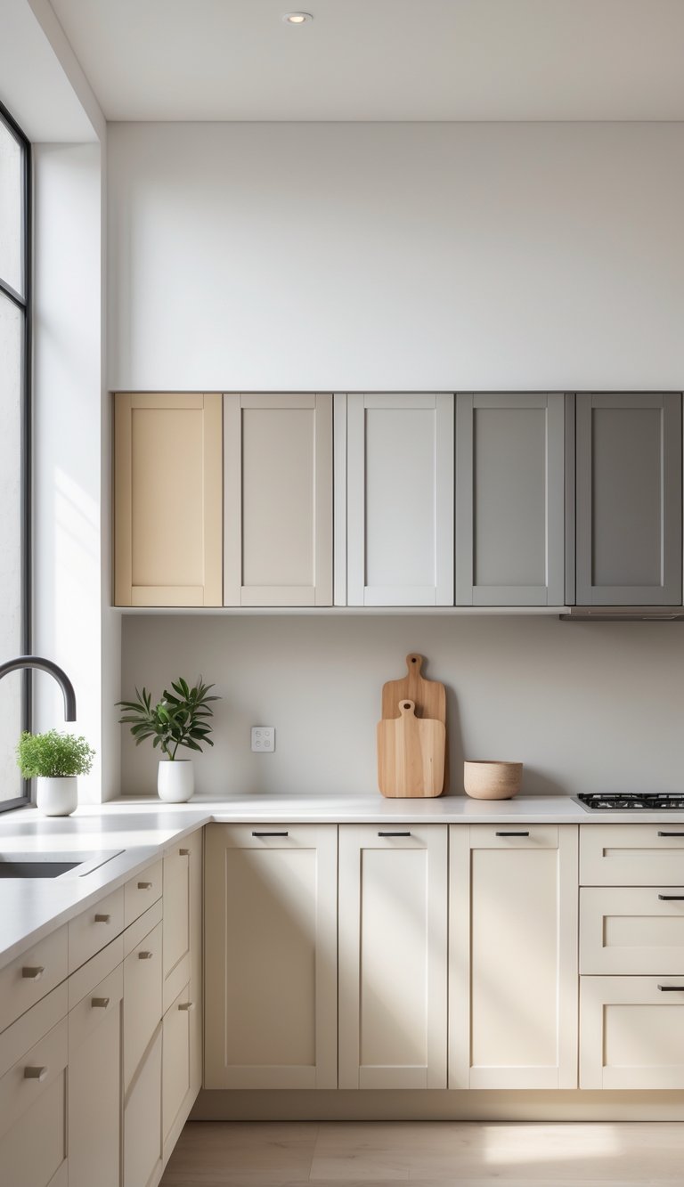
Neutral cabinet colors bring a lot to any kitchen. They help open up the space and last longer in style.
Picking the right neutral shade can make your kitchen feel brighter and more inviting. Things stay fresh for years, not just one season.
Enhancing Kitchen Space
I’ve noticed that neutral colors like soft beiges, greys, and whites make kitchens feel bigger and more open. These shades catch natural light better, so the whole room feels brighter.
This helps especially in smaller kitchens or if you don’t have a ton of windows. Neutral colors also create a clean and calm atmosphere.
When I use them on cabinets, the kitchen feels less cluttered and more organized. Plus, neutral tones blend smoothly with wood, metal, or stone.
Decorating gets easier since you don’t have to stress about colors clashing.
Timeless Appeal
I love neutral cabinet colors because they don’t go out of style fast. Kitchen trends come and go, but neutrals stay classic.
This means you don’t have to repaint your cabinets every few years. Neutrals work with just about any kitchen design, from traditional to modern.
Christmas & Year-End Deals On Amazon !
Don’t miss out on the best discounts and top-rated products available right now!
*As an Amazon Associate, I earn from qualifying purchases.
Whether you want a cozy farmhouse feel or a sleek, contemporary vibe, neutral cabinets fit right in. For example, greige shades add warmth and sophistication but never feel boring.
Using neutral colors also helps if you want to update other kitchen parts later. You can swap out accessories or change wall paint without worrying about matching your cabinets.
It keeps your options open and your kitchen looking good over time.
Tips for Styling With Neutral Tones
Working with neutral kitchen cabinet colors? Small details matter. The right hardware and backsplash add personality and depth, while the overall look stays calm and balanced.
These little touches break up the neutral shades and give the space some interest without overwhelming it.
Pairing With Hardware
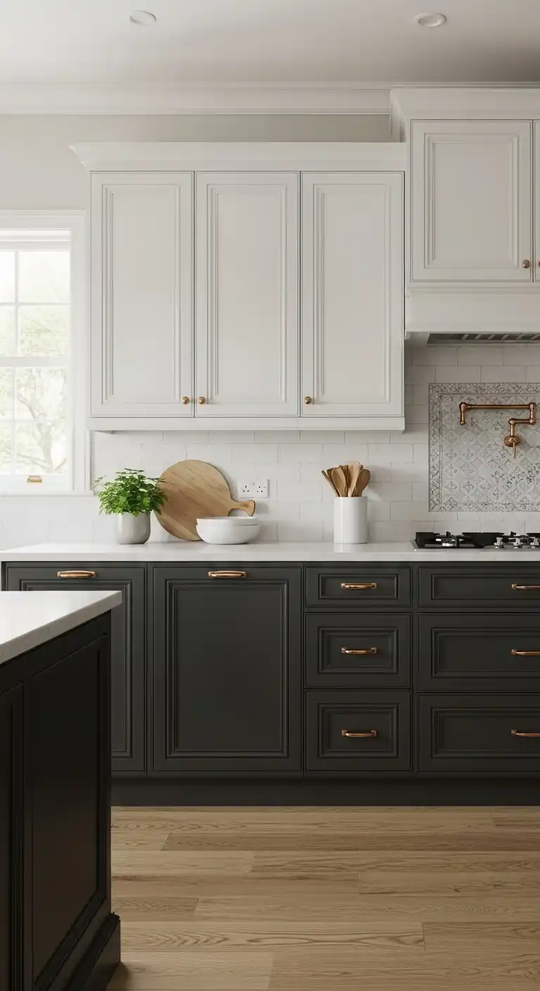
I’ve found hardware really sets the tone in a neutral kitchen. Metals like brushed nickel, matte black, or antique brass look great with soft beige, gray, or white cabinets.
Matte black handles give light cabinets a modern, sleek edge. Brass pulls add warmth and a bit of elegance.
The style of your hardware changes the vibe, too. Simple bar pulls feel contemporary, while round knobs are more classic and cozy.
If you mix finishes, do it with care—maybe black drawer pulls and brass knobs for a little variety but not chaos.
Honestly, I’d avoid super shiny or overly fancy hardware if your cabinets are understated. The right hardware should highlight the cabinet color and shape, not steal the show.
Accentuating With Backsplashes
Backsplashes are a great way to add texture and pattern to a neutral kitchen.
I like picking tiles or materials that gently contrast with the cabinets. White subway tiles behind beige cabinets? Always a classic. Soft gray tiles with white cabinetry work too.
Christmas & Year-End Deals On Amazon !
Don’t miss out on the best discounts and top-rated products available right now!
*As an Amazon Associate, I earn from qualifying purchases.
Patterns like herringbone or hexagon add just enough visual interest without fighting the calm cabinet colors.
Natural materials like marble or a textured stone bring warmth and a touch of luxury to neutrals.
I try to stick to the same tone family for color, just to keep things soothing. For example:
| Cabinet Color | Good Backsplash Options |
|---|---|
| Light Gray | White or soft gray subway tiles |
| Beige | Cream, marble, or soft green tiles |
| White | Marble, soft blue, or light taupe |
Pick backsplash designs that complement the neutral shades, not compete with them. That way, you get a layered, welcoming vibe—nothing feels forced or overdone.

