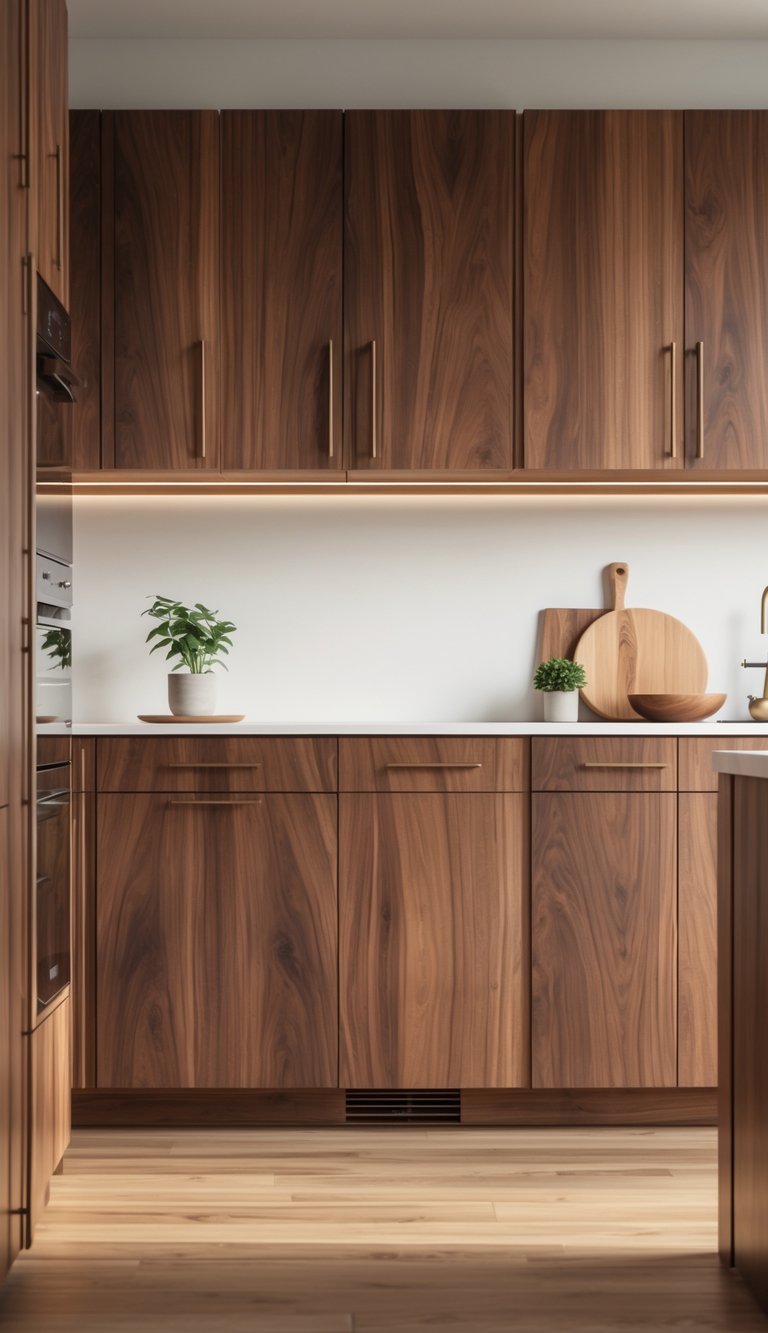
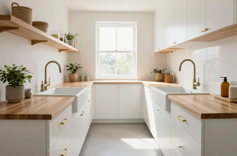
Kitchen Acrylic Color Ideas: 17 Designer Picks

Ready to give your kitchen a vibrant makeover that screams style?
I know the feeling of staring at outdated cabinets or bland walls, craving a fresh look that makes every meal prep feel inspiring.
Choosing the right acrylic colors can completely transform your kitchen into a space that’s both functional and fabulous.
That’s why I’ve rounded up 17 designer-approved acrylic color ideas that will spark your creativity.
From bold pops to soothing neutrals, these picks will help you create a kitchen that’s uniquely yours—without breaking the bank!
Why Choose Acrylic for Your Kitchen?
Acrylic finishes are a favorite among designers for their high-gloss, mirror-like sheen that adds a modern, luxurious touch.
Unlike traditional laminates, acrylic is scratch-resistant, easy to clean, and highly customizable, making it ideal for cabinetry, countertops, and backsplashes.
Its reflective quality can brighten even the smallest kitchens, and with proper care, it maintains its luster for years.
Below, I’ve curated a list of 17 color ideas that blend current trends with timeless appeal, ensuring your kitchen stands out.
Vibrant Coral Glow

Coral is a lively, warm shade that injects energy into any kitchen.
This acrylic color idea creates a welcoming vibe while maintaining sophistication.
Its versatility pairs well with small kitchen color ideas for a cozy yet vibrant feel.
Use coral on cabinets or accent walls for a pop of personality.
Why Choose Coral?
Coral balances warmth and playfulness, making it ideal for social kitchens.
It complements natural light, enhancing the space’s brightness.
Pair it with white gloss kitchen flooring for a crisp, modern look.
How to Use It
Apply coral acrylic to upper cabinets, keeping lower ones neutral for balance.
Add metallic hardware for a chic touch.
Combine with soft greys or whites to avoid overwhelming the space.
Serene Sky Blue
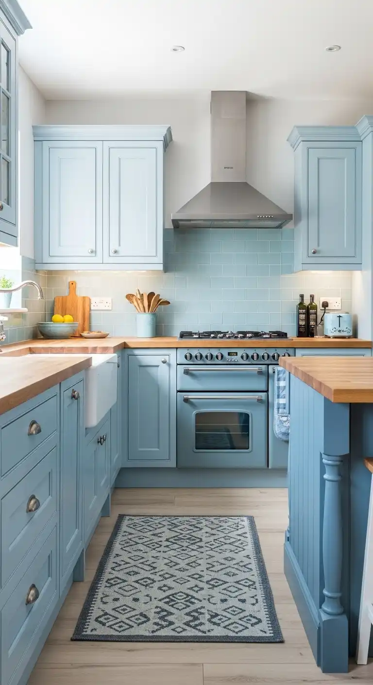
Sky blue acrylic brings a calming, airy feel to kitchens.
This color reflects tranquility, making it perfect for busy households.
It pairs beautifully with grey shaker kitchen flooring for a cohesive look.
Why Choose Sky Blue?
This shade promotes relaxation and openness, ideal for smaller spaces.
It works well with kitchen cabinet color ideas with blue islands for a harmonious palette.
How to Use It
Use sky blue on cabinetry or backsplashes.
Pair with wooden countertops for warmth.
Add white accents to enhance the airy vibe, ensuring a timeless appeal.
Bold Midnight Navy

Midnight navy acrylic adds drama and elegance to kitchens.
This deep hue creates a luxurious feel, perfect for modern designs.
It complements kitchen flooring ideas with dark cabinets for a striking contrast.
Why Choose Navy?
Navy offers depth without being as stark as black.
It’s versatile, suiting both large and small kitchens.
Its richness elevates acrylic’s glossy finish.
How to Use It
Apply navy to lower cabinets, paired with white uppers.
Incorporate gold hardware for sophistication.
Use kitchen dark wood flooring to enhance the luxurious aesthetic.
Earthy Sage Green

Sage green acrylic is a nature-inspired choice that brings tranquility to kitchens.
This muted tone aligns with earthy green kitchen color palettes for a grounded, organic vibe.
Why Choose Sage Green?
Sage green promotes calmness and pairs well with natural materials.
It’s a timeless acrylic color idea that suits various kitchen styles, from rustic to modern.
How to Use It
Use sage green on cabinetry with matte black hardware.
Pair with earthy kitchen flooring like terracotta tiles for warmth.
Add cream accents for softness.
Classic Ivory Cream

Ivory cream acrylic offers a warm, inviting look for kitchens.
This neutral shade is perfect for kitchen flooring ideas with cream cabinets, creating a timeless aesthetic.
Why Choose Ivory Cream?
Ivory cream is versatile, complementing any decor style.
Its soft glow enhances acrylic’s sleek finish, making kitchens feel spacious and welcoming.
How to Use It
Apply ivory cream to all cabinets for a cohesive look.
Pair with cottage kitchen flooring like light wood for a cozy feel.
Add brass accents for elegance.
Sleek Charcoal Grey

Charcoal grey acrylic delivers a modern, sophisticated vibe.
This bold neutral pairs well with grey shaker kitchen flooring for a sleek, cohesive design.
Why Choose Charcoal Grey?
Charcoal grey offers a contemporary edge without being too dark.
It’s a practical acrylic color idea for high-traffic kitchens, hiding smudges effectively.
How to Use It
Use charcoal grey on cabinets, paired with white countertops.
Incorporate elegant kitchen flooring like marble for luxury.
Add pops of color through accessories.
Warm Terracotta

Terracotta acrylic brings earthy warmth to kitchens, evoking a rustic charm.
This color pairs beautifully with earthy neutrals farmhouse kitchen color schemes.
Why Choose Terracotta?
Terracotta adds a cozy, inviting feel, perfect for farmhouse or bohemian kitchens.
Its acrylic finish ensures durability and a modern twist.
How to Use It
Apply terracotta to lower cabinets, keeping uppers light.
Pair with kitchen concrete flooring for an industrial edge.
Add woven textures for warmth.
Crisp White Gloss

White gloss acrylic is a timeless choice for kitchens, offering a clean, bright look.
It pairs perfectly with white gloss kitchen flooring for a seamless design.
Why Choose White Gloss?
White gloss maximizes light, making kitchens feel larger.
This acrylic color idea is ideal for minimalist or modern spaces, offering versatility.
How to Use It
Use white gloss on all cabinetry for a sleek look.
Pair with galley kitchen flooring like tiles for practicality.
Add colorful accents for personality.
Vibrant Teal Accent

Teal acrylic adds a bold, refreshing touch to kitchens.
This jewel-toned shade pairs well with green kitchen flooring ideas for a cohesive look.
Why Choose Teal?
Teal brings energy and sophistication, ideal for accent pieces.
Its acrylic finish enhances its vibrancy, making it a standout choice.
How to Use It
Use teal on an island or backsplash, keeping other elements neutral.
Pair with eclectic kitchen flooring like patterned tiles for a bold statement.
Soft Lavender Haze

Lavender acrylic introduces a subtle, whimsical charm to kitchens.
This pastel shade pairs well with small kitchen color ideas for a delicate touch.
Why Choose Lavender?
Lavender adds a unique, calming vibe without overwhelming.
Its acrylic finish ensures a modern, glossy look that’s easy to maintain.
How to Use It
Apply lavender to upper cabinets, paired with white lowers.
Use white gloss kitchen flooring for brightness.
Add silver hardware for elegance.
Rich Emerald Green
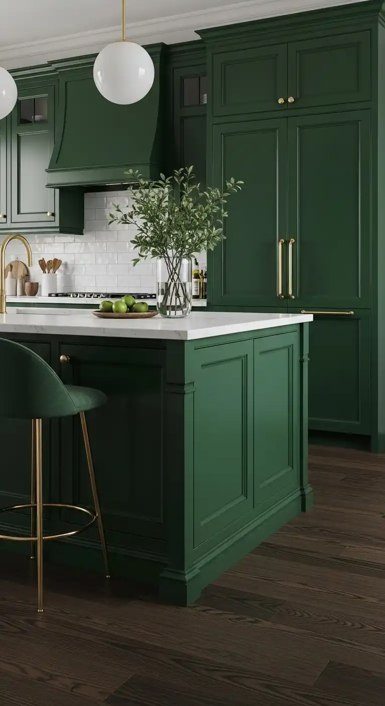
Emerald green acrylic exudes luxury and depth.
This bold shade pairs beautifully with dark green kitchen flooring for a cohesive, elegant look.
Why Choose Emerald Green?
Emerald green creates a jewel-box effect, perfect for statement kitchens.
Its acrylic finish enhances its richness, making it a designer favorite.
How to Use It
Use emerald green on cabinets or an island.
Pair with elegant kitchen flooring like dark wood for sophistication.
Add gold accents for glamour.
Muted Blush Pink

Blush pink acrylic adds a soft, feminine touch to kitchens.
This subtle hue pairs well with cottage kitchen flooring for a charming aesthetic.
Why Choose Blush Pink?
Blush pink is warm and inviting, ideal for cozy kitchens.
Its acrylic finish ensures durability while maintaining a delicate look.
How to Use It
Apply blush pink to cabinets, paired with white countertops.
Use kitchen flooring ideas inexpensive like vinyl for budget-friendly charm.
Add natural wood accents.
Deep Plum Elegance

Plum acrylic brings a rich, moody vibe to kitchens.
This sophisticated shade pairs well with kitchen flooring ideas with dark cabinets.
Why Choose Plum?
Plum adds depth and luxury, perfect for bold designs.
Its acrylic finish enhances its glossy, modern appeal, making kitchens stand out.
How to Use It
Use plum on lower cabinets, paired with light uppers.
Incorporate kitchen dark wood flooring for warmth.
Add brass hardware for elegance.
Sunny Yellow Burst

Sunny yellow acrylic injects cheer and brightness into kitchens.
This vibrant shade pairs well with eclectic kitchen flooring for a playful look.
Why Choose Yellow?
Yellow creates a joyful, energetic atmosphere.
Its acrylic finish ensures a glossy, durable surface that’s easy to clean.
How to Use It
Apply yellow to an island or accent wall.
Pair with kitchen extension flooring ideas like tiles for durability.
Add neutral tones to balance the vibrancy.
Cool Mint Green
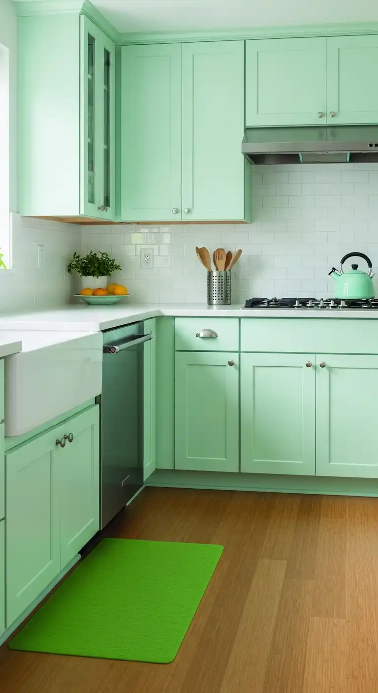
Mint green acrylic offers a fresh, modern look for kitchens.
This light shade pairs beautifully with green kitchen flooring ideas.
Why Choose Mint Green?
Mint green is refreshing and versatile, suiting various styles.
Its acrylic finish enhances its clean, crisp aesthetic, perfect for airy kitchens.
How to Use It
Use mint green on cabinets, paired with white countertops.
Incorporate eco-friendly kitchen flooring like bamboo for sustainability.
Add chrome accents for a modern touch.
Japandi-Inspired Taupe

Taupe acrylic, inspired by Japandi aesthetics, blends minimalism and warmth.
This neutral shade pairs well with Japandi kitchen flooring.
Why Choose Taupe?
Taupe offers a serene, sophisticated look, perfect for minimalist kitchens.
Its acrylic finish adds a sleek, modern edge to the space.
How to Use It
Apply taupe to all cabinetry for a cohesive look.
Pair with craftsman kitchen flooring like wood for warmth.
Add natural textures for authenticity.
Metallic Bronze Accent

Bronze acrylic adds a unique, luxurious touch to kitchens.
This metallic shade pairs well with elegant kitchen flooring for a glamorous look.
Why Choose Bronze?
Bronze brings warmth and sophistication, ideal for accent pieces.
Its acrylic finish enhances its reflective quality, creating a stunning effect.
How to Use It
Use bronze on an island or backsplash.
Pair with kitchen concrete flooring for an industrial vibe.
Add neutral tones to balance the boldness.
How to Choose the Right Acrylic Color for Your Kitchen
Selecting the perfect acrylic color depends on several factors. Here’s how I approach it with my clients:
- Kitchen Size: Lighter colors like white or cream make small kitchens feel larger, while darker shades like navy or charcoal suit spacious layouts.
- Lighting: Acrylic’s reflective nature amplifies light. In dimly lit kitchens, opt for bright or neutral tones to enhance brightness.
- Style: Match the color to your kitchen’s aesthetic—crisp white for modern, sage green for rustic, or bold red for eclectic.
- Complementary Elements: Consider countertops, backsplashes, and hardware. For example, I pair navy acrylic with gold handles for a luxurious contrast.
Tips for Maintaining Acrylic Kitchen Surfaces
Acrylic’s durability is a major draw, but proper care ensures longevity. Here are my expert tips:
- Clean Regularly: Use a soft microfiber cloth and mild soap solution to wipe down surfaces. Avoid abrasive cleaners that can dull the finish.
- Prevent Scratches: While acrylic is scratch-resistant, avoid sharp objects. Use cutting boards and trivets on countertops.
- Polish for Shine: I recommend a non-abrasive polish like a glass cleaner to maintain the glossy finish.
- Avoid Heat Exposure: Keep hot pots away from acrylic surfaces to prevent warping or discoloration.
Current Kitchen Color Trends
I’ve noticed a shift toward bold yet balanced color palettes.
Jewel tones like emerald and teal are trending for their rich, luxurious feel, while earthy hues like sage and olive remain popular for their calming effect.
Two-tone kitchens—combining colors like navy and white or blush and gray—are also gaining traction, allowing homeowners to experiment without overwhelming the space.
Common Mistakes to Avoid
From my experience, here are pitfalls to steer clear of:
- Overloading with Bold Colors: Using bright colors like red or yellow across all cabinets can feel chaotic. I suggest using them as accents.
- Ignoring Lighting: Dark colors in poorly lit kitchens can make the space feel cramped. Always test samples under your kitchen’s lighting.
- Neglecting Maintenance: Acrylic requires regular cleaning to maintain its shine. Skipping this can lead to a dull appearance over time.
Wrap Up
Choosing the right acrylic color for your kitchen is a blend of personal style, practical considerations, and design trends.
Whether you opt for timeless white, bold emerald, or trendy sage green, acrylic’s versatility and durability make it a standout choice.
By considering your kitchen’s size, lighting, and aesthetic, and following my maintenance tips, you can create a space that’s both functional and visually stunning.
With these 17 designer picks, I hope you’re inspired to transform your kitchen into a space that reflects your unique style.
FAQs About Acrylic Kitchen Colors
Q: Are acrylic finishes durable for kitchen use?
A: Yes, acrylic is highly durable, scratch-resistant, and easy to clean, making it ideal for busy kitchens. I’ve seen it withstand years of use with proper care.
Q: Can I mix multiple acrylic colors in my kitchen?
A: Absolutely. I often design two-tone kitchens, like white upper cabinets with navy lowers, for a balanced, modern look.
Q: How do I prevent fingerprints on glossy acrylic surfaces?
A: Use a microfiber cloth for regular cleaning, and consider matte acrylic finishes if fingerprints are a concern, though they’re less common.
Q: Are bold colors like red or yellow practical for kitchens?
A: Bold colors work well as accents but can overwhelm if overused. I recommend pairing them with neutral tones for balance.
Q: How do acrylic finishes compare to laminates?
A: Acrylic offers a glossier, more reflective finish than laminates and is more resistant to scratches and fading, based on my projects.


